Circular Flag Icons for a Country Picker UI
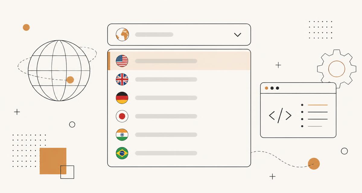
A country picker is one of the most common form controls on the web, and also one of the most frequently done badly. This post walks through building a select or combobox with circular flag icons, covering search, keyboard behaviour, accessibility and the phone number case. The flag assets referenced throughout are the 800+ circular SVG country, state, language and symbol flags available at /flags.
Select versus combobox
A native select element with flags rendered inside option elements only works in a limited way, because most browsers do not allow arbitrary images inside native option rendering. For a fully custom look with flags next to country names, you need a combobox pattern built from a text input and a listbox popup, following the ARIA combobox role with the appropriate aria-expanded and aria-activedescendant attributes.
If you do not need custom flag rendering and are happy with the operating system list style, a plain native select with country names only is simpler, more accessible by default, and works correctly on every platform without extra JavaScript.
Search by name, code and alt names
Users search for countries in different ways: full name, ISO 3166-1 alpha-2 code such as DE, alpha-3 code such as DEU, or a common alternative name such as Holland for the Netherlands or Burma for Myanmar. Build the searchable index as an array of records, each with the country name, both codes, and a list of alternative names, and match the typed query against all of these fields with a simple substring or fuzzy comparison.
Sort matches so that name matches starting with the query appear before matches found only in the middle of a word or in an alt name, which keeps the most likely result near the top.
Virtualising the list
With around 250 countries and territories, rendering every option as a DOM node when the list opens is usually fine on modern hardware, but if the picker also lazily loads flag images or the row markup is heavier, list virtualisation avoids jank by only rendering the rows currently visible in the scroll viewport, plus a small buffer above and below.
A basic virtualisation only needs a fixed row height, the total list length, and the current scroll offset to calculate which slice of the array to render, and does not require a heavy library for a case this simple.
ARIA roles and labelling
The input needs role="combobox", aria-autocomplete set appropriately, aria-expanded reflecting whether the popup is open, and aria-controls pointing at the id of the listbox. Each option in the popup needs role="option" and a stable id so aria-activedescendant can reference it. The listbox itself needs role="listbox".
Announce the currently selected country in a way a screen reader can pick up, either through the input value itself or a visually hidden live region, so that users relying on assistive technology know what has been selected after they press Enter.
Flags are not a label
A flag icon alone is not sufficient identification for a country in an accessible interface. Some flags are visually similar, such as Indonesia and Monaco, or Romania and Chad, and a flag conveys no information at all to a screen reader user unless it also has descriptive text or an appropriate accessible name. Always pair the flag image with the country name as visible text, and if the image itself carries meaning, give it an empty alt attribute since the adjacent text already communicates the country.
Colour blindness is a further reason not to rely on flags as the sole distinguishing feature in a densely packed list; text remains the reliable identifier.
Phone number inputs with dial codes
A common variant of the country picker is a phone number field with a flag and dial code prefix, such as a UK flag next to +44. This needs a second piece of data beyond the ISO code, namely the international calling code, and some countries share a calling code with others, such as the North American Numbering Plan countries that all use +1. Decide whether the picker groups these under one flag or lists each territory separately, since both are used in production interfaces and the right choice depends on your user base.
Store the selected value as the ISO country code internally rather than the dial code alone, since dial codes are not unique and cannot always be mapped back to a single country without ambiguity.
Performance and asset choice
SVG flags such as those on /flags render sharply at any size and are small enough that loading all 256 upfront rarely causes a noticeable delay, especially if they are combined into a single SVG sprite so the browser only makes one request. If you would rather use raster images, the PNG export sizes offered for each flag, from 32 up to 512 pixels, let you choose an appropriately small size for a compact list row rather than downloading an oversized image and scaling it down in CSS.
Whichever format you choose, keep flag rendering as a background image or an img element with empty alt text, never as the accessible name for the option itself.
A worked example: minimal combobox markup
A minimal accessible structure pairs a text input with role="combobox", aria-expanded, aria-controls and aria-autocomplete="list", and a sibling div with role="listbox" and a matching id containing the option elements. Each option needs role="option", a unique id such as option-de for Germany, and aria-selected reflecting whether it is the current value. The input keeps real focus at all times, and aria-activedescendant on the input points at the id of whichever option is currently highlighted as the user moves through the list with the keyboard.
On selection, whether by pointer click or Enter key, the input value updates to the country name, the popup closes, aria-expanded flips to false, and the underlying form field stores the ISO code rather than the display text, so the visible label and the submitted value can differ safely.
Browser and platform notes
Custom combobox patterns built from a text input and a positioned listbox behave consistently across current desktop and mobile browsers, but on-screen keyboards on mobile can obscure part of the popup if it is not scrolled into view when it opens, so scroll the input into view explicitly on focus rather than relying on default browser scrolling.
Screen reader behaviour for aria-activedescendant varies slightly between assistive technology combinations, particularly around how promptly the active option is announced while typing quickly, so testing with at least one screen reader on desktop and one on mobile before shipping is worthwhile rather than assuming ARIA compliance alone guarantees a good experience.
Performance checklist
Points worth checking specifically for a large country picker.
- Virtualise the option list once row markup includes more than a flag and plain text
- Debounce search input filtering slightly so fast typing does not re-filter on every keystroke
- Precompute the search index of names, codes and alt names once rather than rebuilding it per keystroke
- Avoid re-rendering the entire list on every character; only re-render rows whose visibility changed
- Cache the parsed country dataset in memory across multiple picker instances on the same page
FAQ
Should the picker default to the value detected from the browser locale? It is a reasonable default for new sessions, but always let the user change it, and never infer a country silently from IP-based geolocation for anything the user has not explicitly consented to.
What about territories that are not independent countries, such as Puerto Rico or Hong Kong? Decide up front whether the list follows ISO 3166-1, which includes many such territories separately from their parent country, since users searching for a specific territory expect to find it rather than being folded into a larger country entry.
Is a native select ever the right choice for this use case? Yes, if flag icons are not a hard requirement, a native select with country names is simpler, fully accessible out of the box, and works correctly on every platform without any of the ARIA wiring described above.
Questions about the tools in this guide
Short answers about the hubs this article touches, each linking straight to the tool.