Flexbox Cheat Sheet With Practical Examples
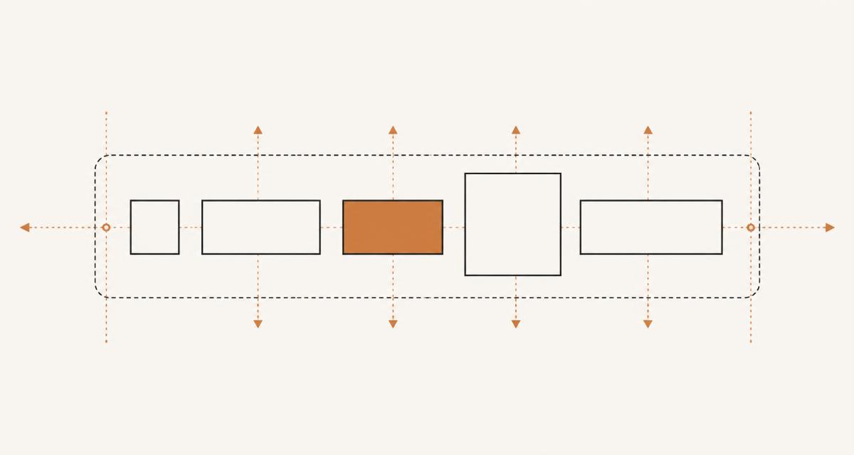
Flexbox has a small set of properties, but they split across two different targets and interact in ways that are easy to misremember. This cheat sheet groups the properties by where they apply, explains the axes they act on, and lists the bugs that come up most often in real layouts.
Container properties versus item properties
Flexbox properties split cleanly into two groups: properties set on the flex container, such as display: flex, flex-direction, flex-wrap, justify-content, align-items and gap; and properties set on the flex items themselves, such as flex-grow, flex-shrink, flex-basis, align-self and order.
Mixing these up is one of the most common mistakes. Setting justify-content on a child does nothing, and setting flex-grow on the container does nothing. If a property is not affecting layout, checking whether it is applied to the right element is usually the first thing to try.
- Container: display, flex-direction, flex-wrap, justify-content, align-items, align-content, gap
- Item: flex-grow, flex-shrink, flex-basis, flex (shorthand), align-self, order
Main axis and cross axis
Every flex layout has a main axis and a cross axis, and which is horizontal or vertical depends on flex-direction. With row, the main axis runs left to right and the cross axis runs top to bottom; with column, this is reversed. justify-content always works along the main axis, and align-items always works along the cross axis, regardless of which direction that happens to be.
Remembering this mapping avoids a lot of confusion, because the same property name produces a different visual result depending purely on flex-direction.
The flex shorthand and the flex-basis trap
The flex shorthand sets grow, shrink and basis in one declaration: flex: 1 1 0 means grow, shrink and a basis of zero. A common mistake is writing flex: 1 and assuming it behaves the same as flex: 1 1 0, when in fact flex: 1 expands to flex: 1 1 0%, and flex: auto expands to flex: 1 1 auto, which uses the content size as the starting point instead of zero.
This distinction matters when items have different amounts of content: with a basis of 0%, items are sized purely by their grow ratio, but with a basis of auto, larger content still gets more space before the grow ratio is applied. If your flex items are not distributing space the way you expect, checking the basis value is the first thing to look at.
Gap, and why it replaced margin hacks
The gap property adds consistent spacing between flex items without the negative margin tricks that were needed before it was supported. gap: 16px adds space in both directions when wrapping is enabled, or row-gap and column-gap can be set separately for more control.
Because gap only affects space between items and not around the outer edge of the container, it avoids the extra spacing problems that margin-based approaches used to cause on the first and last item.
Wrapping and multi-line layouts
By default flex items are forced onto a single line and will shrink to fit, which is rarely what you want for a row of cards or tags. Setting flex-wrap: wrap allows items to move onto new lines when they run out of space, turning the container into multiple flex lines.
Once wrapping is enabled, align-content becomes relevant, since it controls how the lines themselves are distributed within the container, separately from how items are aligned within each line.
align-content versus align-items
align-items controls alignment of items within a single line along the cross axis, and it has an effect even with a single line of content. align-content controls the spacing between multiple lines, and it only has a visible effect once flex-wrap creates more than one line and there is extra space in the cross axis to distribute.
If align-content does not seem to do anything, the most likely cause is that the container is not wrapping, or all the content already fits on one line, leaving nothing for align-content to distribute.
The min-width: auto overflow bug
Flex items have a default minimum size of auto, which means they will not shrink smaller than their content, even if flex-shrink is set. This causes text or a long unbreakable string to overflow its container instead of wrapping, because the browser refuses to shrink the item below its content size.
The fix is to explicitly set min-width: 0 (or min-height: 0 for column layouts) on the item, which allows it to shrink past its content size and lets normal text wrapping or overflow handling take over.
Ordering and accessibility
The order property lets you change the visual order of flex items without touching the HTML, which is useful for reflowing a layout at different breakpoints. It does not change the order that screen readers or keyboard tab navigation follow, since those still use document order.
Using order to move an item far from its logical position in the markup can create a mismatch between what sighted mouse users see and what keyboard or screen reader users experience, so it is best reserved for small visual reorderings rather than a full layout restructure.
When Grid is the better choice
Flexbox lays out items along a single axis at a time, which makes it well suited to rows of buttons, navigation bars, and content that needs to distribute along one direction. Once a layout needs to align items in both rows and columns at the same time, such as a card grid where cells need to line up vertically and horizontally, CSS Grid handles that with fewer workarounds.
For a side-by-side comparison of properties and syntax, the /cheat-sheets section has a dedicated Grid cheat sheet alongside this Flexbox reference, which is worth checking before deciding which layout model fits a given component.
A worked example: a responsive card row
A row of cards that should sit side by side on wide screens and wrap onto multiple lines on narrow ones combines several of the properties above. The container gets display: flex, flex-wrap: wrap and a gap value for consistent spacing, while each card gets flex: 1 1 240px, meaning it grows and shrinks but starts from a 240 pixel basis, so cards settle at a comfortable width and wrap to a new line once there is no longer room for another 240 pixel card plus the gap.
Adding min-width: 0 to each card prevents a long unbroken product name or price from forcing a card wider than its flex-basis, and align-items: stretch, the default, keeps every card in a row the same height even when their content differs, which is usually what a card grid needs without any extra height calculation.
Browser support
Flexbox has been supported without vendor prefixes in every current browser for a long time, and the gap property specifically for flex containers, which arrived later than gap support for CSS Grid, is now also broadly supported in current browser versions. If a project still needs to support very old browser versions where flex gap is missing, margin-based spacing on all but the first item in each row is the fallback, though this is rarely a practical concern for current projects.
align-content behaviour with flex-wrap has been consistent across browsers for years, so cross-browser flexbox bugs today are far more often caused by the min-width: auto default and the flex-basis confusion covered above than by genuine implementation differences between browsers.
Debugging checklist
When a flex layout is not behaving as expected, work through these checks roughly in order.
- Confirm display: flex is on the intended parent, not a nested wrapper one level too deep
- Check whether the property you are setting belongs on the container or the item
- Print or inspect the computed flex-basis, since flex: 1 and flex: auto behave differently
- Add min-width: 0 or min-height: 0 if content is overflowing instead of shrinking or wrapping
- Verify flex-wrap is set if multiple lines are expected, since the unwrapped default silently shrinks items instead
FAQ
Why does justify-content: space-between look wrong with only one item? With a single flex item, space-between has nothing to distribute space between, so the item sits at the start of the main axis, which surprises people expecting it to centre.
Does order affect the tab order for keyboard users? No, order only changes visual position; keyboard tab order and screen reader reading order both follow the underlying document order regardless of any order value applied in CSS.
Is it safe to mix flex and grid in the same layout? Yes, it is common to use Grid for the overall page structure and Flexbox for smaller components inside a grid cell, such as aligning icons and text within a card, since the two models were designed to complement rather than replace each other.
Questions about the tools in this guide
Short answers about the hubs this article touches, each linking straight to the tool.